00:00
00:00
NAveryW
Nicholas Walstrom @NAveryW

Age 34, Male

Student, sometimes.

Texas or something

Joined on 5/20/05

Level:
10
Exp Points:
910 / 1,110
Exp Rank:
74,953
Vote Power:
5.18 votes
Rank:
Civilian
Global Rank:
80,556
Blams:
19
Saves:
57
B/P Bonus:
0%
Whistle:
Normal
Trophies:
8
Medals:
226

NAveryW's News

Posted by NAveryW - September 9th, 2012


UPDATE: The game has been released now with centering added to the camera on pressing X, but I'm leaving the post up below as it originally appeared and with the first update. I'll still go back and fix any glitches found and consider implementing suggested improvements to the overall gameplay, though.

Have Flash Player 11.4? Want to try my new game before it's officially released? Here it is!

In retrospect, before I made a processor intensive game relying both on split second player input and Flash's still newish Stage3D abilities, I probably should have not done that at all and made a game that doesn't require precise timing instead.

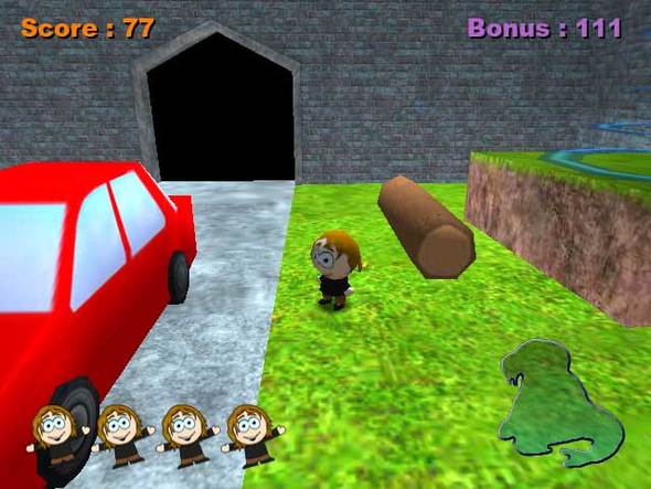
Yesterday I finished The Ramon Osborn Show game, a 3D puzzle-'em-up platformer based on the show-within-a-show briefly seen in my 2005 cartoon Of the Couch. As far as I can tell, I've gotten it glitch free (enough), but most test players said it lagged too much to play.

So, now I'm trying exporting to Flash Player 11.4 with its new constrained mode for Stage3D. Does it run smoothly enough to be playable?

If so, I intend to release it later today. (This being after midnight, by "today" I mean September 9.) If not, well... uh... I guess I'll still release it and... hopefully it'll be more fun after Flash gets faster.

P.S. Key input sometimes sticks in Firefox. You might not want to use Firefox. If you're unable to run and jump at the same time, you should definitely switch browsers.

UPDATE: In response to negative feedback regarding the camera, I've swapped the secondary camera system with the default one. You can still switch to the default one that nobody likes if you want to. Or maybe nobody liked either one; I'm not certain whether anyone read the instructions. Anyway, if you still don't like the camera system, let me know how you feel I should change it. It would be easy to make it so you can rotate the camera with the keyboard, but I feel the current click-and-drag-with-mouse system allows for more precision. I guess I could include them both. But let me know what you think I should do, yes.

I Made a 3D Flash Game... But Does It Run Fast Enough to Play?


Posted by NAveryW - October 31st, 2011


Read it here.

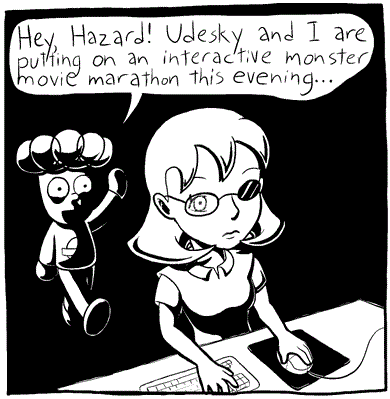
Intended as the beginning of a longer story, but I only managed to complete three pages before Halloween. Which, fortunately, sort of tell a story on their own. A fourth page will probably be added later today. The story will continue throughout the spooooky month of November.

Here's an embedded panel from the comic because why not.

Happy Halloween? Happy Halloween.

Halloween Comic... Or Three Pages of It


Posted by NAveryW - October 12th, 2011


So you may have noticed that I have some cartoons and games up. Most of them take place in the Enthalpy canon, which started with a single-page comic I wrote on October 12, 2001. Or was it October 13, 2001? No way to tell anymore. The only reference frame I have is it was the day after I got back from a vacation during fall break of that year.

Today's the 10th anniversary, so the official Enthalpy website got some significant updates. In particular, the ability to comment on every page of the website, and the upload of one of the old comic books I wrote back in sixth grade.

Is there a reason to really care about the crudely drawn, plagiarism-filled stuff I drew when I was eleven? Probably not, except to show how the canon began and how far I've come.

I've attached an image of an unintroduced Enthalpy character who nobody's heard of before. Yep, she's a girl. That sure is empowering for female viewers.

Also, here's a GIF of Piggly Oink from the animation that would have been released today if I could keep a deadline. I'd have embedded it here if I could get the size down without ruining it. It, uh... looks better than anything I've submitted to Newgrounds so far, so if it makes you want to watch my cartoons, prepare to be disappointed.

10th Enthalversary October 12-13


Posted by NAveryW - May 13th, 2011


I came across a newspaper article containing the following text:

Walt Disney studios will have invested more than four years and an estimated $4 million by the time their feature length "The Rescuers" is released late next year.

That dedication to the art of animation is why the Disney people never have entered the television field.

"We can't do our kind of stuff in that medium," explains Don Duckwell, head of animation at Disney. "Sure, we like to get our work in front of people any way we can, but economics prevents it. Actually, Walt decided many years ago that we would not take shortcuts in our animation, and we feel that's still the best way to operate."

I commend Disney's decision, though it's a shame to find out that I must have hallucinated DuckTales.


Posted by NAveryW - March 9th, 2011


It's great to be able to legally share copyrighted music, and 8tracks.com lets you do just that... with some bizarre restrictions. For example, the play order is randomized the second time someone plays it, and you're not allowed to mention the titles of the songs you use when describing it. So I was going to see how many you could guess, but it turns out it tells you the song that's playing while it plays. I don't remember it doing that the last time I visited the site.

So anyway, here's an eclectic sampling of songs from soundtracks and other albums I've listened to recently. I almost always have either a soundtrack or an audio commentary playing while I'm doing work on the computer that doesn't require editing sound. Audio commentaries are also no good for when I need to write things using language words, so soundtracks are more common.

Mixtape Grabbag Freeforall: Eclectic Soundtrack Jamboree


Posted by NAveryW - November 16th, 2010


Enthalpy

I'm still animating the first episode of Enthalpy, but I finally got the whole website up. Almost everything was up on October 4th, but yesterday I finally got the games and videos pages finalized. Not really finalized, since I'll keep adding more games and videos as I make them (and as the relevance of older ones becomes more apparent), but the layouts and coding and such are complete.

.
/* */
I also discovered thanks to the related videos that there is a completely unrelated web project of the same name that has been in the works for almost as long, a manga-style series by Minyan Wang, who is also a member of Newgrounds. This came as a big surprise to me, as I chose a title that I never would have thought anyone else would think is a good title for a work of fiction.

Plans for the future of (my) Enthalpy, not necessarily exactly in this order:
-Include ads in subsequent games I make (but not in the ones I've already made) on Newgrounds and other sites, but make them all available ad-free on my own
-Buy license for non-watermarked version of jwplayer once I've made $80 in ad revenue
-Put subsequent ad revenue toward buying programs to help with animation and video editing, such as Adobe After Effects and the Swift 3D plugin for Lightwave 3D
-Try to finish "McDarnold's: La Verite" before the Dallas International Film Festival's call for entries closes
-Try to find other film festivals to enter it in because I won't finish in time
-Finish Empire of the Ants; or, Ants Should Be Grand (because that's what the giANTs comic is called) and move onto another comic
-Once I have a sizable collection of comics, publish them (including exclusive stories not on the site) as a book with CreateSpace or another similar site
-Keep on making more episodes of Enthalpy, more comics, and occasionally other videos


Posted by NAveryW - October 20th, 2010


I feel a bit bad for putting non-news in the news section of NG now that it appears a lot of people are actually using it for its intended purpose, but I suppose there isn't any harm. If you object to this, let me know and I'll stop. But for today, I present a long-coming (and very, very long) entry on The Brave Little Toaster.

If you haven't seen the movie, watch it. Rent it from Netflix or buy it from... wherever you can find it. If you can find a good quality VHS version, that's actually just as fine as the DVD. The DVD is grainy, wobbly, flickery, full of edge-enhancement, single-layer, and only has one mostly pointless special feature about the making of the direct-to-video sequels. Also, the DVD censors at least one shot. If you don't know which but have an obvious guess, yes, it's that shot. I remember it also being censored last time it was shown on Disney Channel, so I guess it's something Disney only noticed recently.

And if you've seen the movie but not the recent interview with Jerry Rees (director, screenwriter) and Deanna Oliver (Toaster's voice actress), watch that before reading this. Yes, it's an hour long, so if you don't want to spend that long watching an interview, do something else at the same time that lets you still pay attention to the audio. I was animating while I listened to it.

.
/* */
Continue reading once you've accomplished those two things. If you don't care to accomplish those two things, you probably won't care much about what I'm writing anyway.

First off, I think The Brave Little Toaster represents an ideal independent animated feature in many ways. In almost every way, in fact, except for the animation itself, which, although completely functional, is obviously outsourced and not particularly elegant. That would drag down a weaker movie; Disney's films almost always rely on enormous budgets and fluid animation to drive viewer interest, but The Brave Little Toaster didn't have that option, with a budget of under $2.3 million. Absolutely miniscule for an animated feature. As Jerry Rees said in the interview, Disney movies generally had ~$24 million budgets. And today? The Princess and the Frog had a budget of $105 million. No wonder Disney's not making as much from their movies as they'd like; they'd have to gross the Falkland Islands' GDP just to break even.

I'd talk about how noble the creators' goals were, not dumbing down the film because it's animated or because the primary audience will be children, but Rees said in the interview everything that needs to be said. The crew actually lived in Taiwan for half a year to oversee the overseas animators. That's devotion. And, as Rees pointed out, they pushed boundaries in ways such as putting the human protagonist in an interracial relationship-- That isn't boundary-pushing for the sake of shock or "Oh my god, they actually went there!" laughs (or worse, just for the sake of offending people), but for the sake of... well, justice.

And the musical score... Despite the small budget, the score transcends that of most (all?) modern high-budget animated features. David Newman did a wonderful job with the composition and the New Japan Philharmonic Orchestra did a wonderful job playing it. I'm surprised the NJPO isn't used for film scores more than they are; they seem to mostly do video games, but they've also scored Miyazaki films.

The songs themselves also stand out from those of other animated films. First, every song fits in a different genre, which is something I've always liked. Second, think about all the songs you've seen in Disney movies. Actually, since you're here, that means you've already probably spent a lot of time on TVTropes.org and think about fiction a lot in terms of what tropes they fit into. That's a bad way of looking at things and you should cut it out, but songs in animated musicals do tend to fall into a few categories. And those categories only apply to the songs in The Brave Little Toaster in a very loose sense; "City of Lights" doesn't consist of the characters singing specifically about who they are and why they're going to find their master, and only a few lyrics are actually devoted to conveying that, but it accomplishes the same purpose. If Disney made the movie themselves, the song would be a very on-the-nose affair in which each of the characters expresses his motivations exactly and clearly states his feelings in words. That's completely unnecessary, but ubiquitous.

Symbolism isn't something I like to get into much, since it's very easy for apophenia to take hold and in my opinion if it's impossible to be sure whether what you're interpreting as symbolism is deliberate or not, it may as well not be. But The Brave Little Toaster does a great job with subtleties and conveying important concepts abstractly. In particular, Rees mentioned the flower scene. I first noticed a couple of years ago that that was the point at which Toaster decided he should be nicer to Blanket. I don't think I made the connection that the flower was the same color as Blanket until I heard Rees explain it, but that's actually something that I feel probably isn't necessary to recognize on a conscious level. I don't believe in conveying information subliminally, but it helps with an emotional connection that the viewer may not even notice. I don't look at it as an "Ooh, clever!" thing, but as something that shows master craftsmanship in a way that the viewer only feels but doesn't necessarily notice. The movie's full of that sort of craftsmanship from the very beginning. Pay attention to the way the camera pans through the house. When the camera hits Kirby, for example, it then follows a trail of light leading from the Master's bedroom. That's not something someone thinks about unless deliberately scrutinizing the cinematography to analyze it, but it makes the flow smooth and natural, feeling like a natural progression through the house instead of just moving from one character to the next.

But if you want subtle details that will be completely lost on casual audiences that open up revealing new facets of the movie if you want to spend hours analyizing, you're completely in luck. The song "Worthless" in particular is absolutely chock full of... OK, a bit over a year ago I first noticed how cryptic a lot of the lyrics to that song are and I attempted an analysis. (Hold off on immediately reading the link; I'll explain next paragraph). While seeing if I could determine why Fellini (I correctly assumed Frederico) was mentioned in the song, I came across a blog by Susan Rothman that talks about the song. Rothman related information she gained from the person responsible for the "Worthless" sequence as well as some of her own analysis, and I learned a lot that I wouldn't have otherwise. Unfortunately, the blog seems to be gone now and I have no idea why, so I'm very glad that I found it when I did and am very disappointed that I didn't link to it directly so I might be able to access it again through the Wayback Machine.

The analysis is obsolete, however. There's a lot of speculation that makes sense but is unprovable, and some of the lyrics I couldn't understand at all turned out to be incomprehensible because the transcripts of the lyrics are wrong (including the clumsy subtitles on the DVD). I was recently contacted by email by Aaron Foster, who'd read my analysis of "Worthless", and we continued discussing it through email. I learned a lot from that discussion-- in particular, that I hadn't even been thinking in terms of the marriage of the song and the visuals that go along with it. I'd just been thinking about the song itself.

So I present here a newer analysis. I've tried to be careful not to include speculation that could be interpreted by readers as overanalysis, because although there is a very large amount of what appears to be deliberate symbolism, allusion, and insinuation, a lot of speculation in those regards leads to dead ends so for now I'll avoid it. I don't claim credit for "noticing" all that I write below, as several chunks were pointed out by Susan Rothman and Aaron Foster. The analysis isn't complete by a longshot, but it's better than the old one.

From the beginning of the song:

_____

I can't take this kind of pressure
I must confess one more dusty road
Would be just a road too long

Pretty straightforward. The blue car expresses anxiety, acknowledges he's no longer capable of fulfilling his purpose (and is thus worthless), and is immediately crushed into a cube. Unlike the subsequent cars, he doesn't resist his impending death.

I just cant- I just can't- I just can't seem to get started
Don't have the heart to live in the fast lane
All that is past and gone

The repetition in the pink convertible's first line is reminiscent of a car having ignition trouble, which is exactly what's happening onscreen when she tries to flee the magnet. She resembles a 1950s convertible and mentions "life in the fast lane", suggesting a history of Grease-esque drag races. I'm reluctant to include that here because it could just be a coincidence that fits very well, but each of the other cars alludes to era-appropriate history, often through obscure references, so I think this is a safe assumption.

I come from KC, Missouri
And I got my kicks out on Route 66
Every truck stop from Butte to MO
Motown to Old Alabama
From Texarkana and east of Savannah
From Tampa to old Kokomo

Starting with the red sports car, we get more specific lyrics. Here, we get fond reminiscence of Route 66, which was decertified and replaced by a highway system while The Brave Little Toaster was in production. This souped-up car shows his former owner's celebration of recreational driving and his sense of identity, which is great for Route 66 but not so practical for a highway.

Starting with the line "From Texarkana", look at the sports car's steering wheel. He's steering left and right, trying to drive off the conveyor belt and avoid being crushed, but he can't move.

I once ran the Indy 500
I must confess I'm impressed how I did
And I wonder how close that I came
Now I get a sinking sensation
I was the top of the line
Out of sight, out of mind
So much for fortune and fame

These lyrics are more overtly grim than those preceding. There's a great synchronicity of the visuals with the lyrics as the racecar slowly slides down the funnel as he sings "Now I get a sinking sensation."

Once took a Texan to a wedding
He kept forgetting his loneliness
Letting his thoughts turn to home
And returned

Now the lyrics get a bit cryptic and into you-can't-expect-kids-to-get-this territory. To quote myself from 2009: "I spent around half an hour or so getting really frustrated that I couldn't make any sense from the wedding verse. I recited it to my father once he got home and gave him the context, and after thinking for a bit, he said he interpreted it as that, as a marriage is generally a social event in which everyone is very close together, the man observed how miserable/annoying people are after being together for a while (or he just became miserable/annoyed) and just wanted to go back home. That seems to fit given the nihilistic theme of the song."

I took a man to a graveyard
I beg your pardon, it's quite hard enough
Just living with the stuff I have learned

This car goes by pretty quickly, so try to freezeframe and take note of what kind of car it is. As if the lyrics weren't dark enough already, the man the car took to the graveyard was the corpse. He had a dead man inside him for a while (something I'm sure we all hope to never experience), and it disturbed him to the point that this is what he chooses to sing about as he approaches his own death.

Once drove a surf at the sunset
There were bikinis and buns, there were weenies
Fellini just couldn't forget
Pico, let's go up to Zuma
From Zuma to Yuma, the rumor was
I had a hand in the lay of the land

The car is a wood-paneled station wagon. To quote the book Disney, Pixar, and the Hidden Messages in Children's Films by M. Keith Booker (which I don't own, but Foster linked me to a preview of in Google books), "The evocation of surf culture by this particular verse, of course, immediately recalls (for those old enough to remember) the 1963 hit 'Surf City,' by Jan and Dean, the first surf music song ever to hit No. 1 on the Billboard Chart. The song famously tells of a California beach where there are 'two girls for every boy,' which the singers are visiting in their old Ford 'woodie.' This song, of course, is particularly relevant here because the station wagon involved is described as being dilapidated (lacking, among other things, a back seat or rear window), yet still usable and able to 'get me where I wanna go.'" Sure enough, the singing "woodie" does seem to lack a back seat and rear window.

The lyrics to the second line of this verse are slightly different on the soundtrack than in the movie. On the soundtrack, the woodie sings something like "There were kinis and huns on the weenies". The first line is usually written as "Once drove a surfer to Sunset", which Susan Rothman took to mean Sunset Blvd., which leads to Will Rogers beach, but in both the soundtrack and the movie, I think it sounds much more like "surf at the sunset".

It's hard to interpret the bikinis/buns/weenies line in a non-sexual manner. To quote myself from 2009 on Rothman's statements about this verse, which is all I can do since the blog now seems to be gone, "She made several cryptic statements about 'boners' that I couldn't quite make sense of, but using that as a base looked into Fellini and sexuality. Apparently, Fellini was a very loose man, having affairs and showing little respect for his wife. Fellini's films always contained autobiographical elements, and his film Amarcord was partially a self-mockery regarding his inability to 'outgrow foolish sexual fantasies'. I'm not even going to get into Satyricon. Anyway, the point is that the line is sexual and refers to the bikinis, buns and weenies obsessing Fellini. According to Susan, Fellini was referenced because his films include 'autobiographical images of himself laced into artistic works', which is what Cypherd was doing. This goes even further into the film with the TV including himself in a commercial for Ernie's. Cypherd told Susan that the advertisement for Ernie's Dump (eventually becoming Crazy Ernie's Amazing Emporium of Total Bargain Madness) represented 'elements he knows about packaging and slanted publicity in general'."

Right after Fellini is referenced by name for the sake of evoking his fourth wall-teasing (and in some cases, such as , fourth wall-annihilating) movies, one of the station wagon's headlights falls off and smashes into your TV set, and Lampy looks through the resulting hole. This is the only instance of The Brave Little Toaster in which the fourth wall is broken, and in this case it's broken literally.

Rothman interpreted "Pico, let's go up to Zuma" as referring to Pico Blvd. and Zuma Beach, and since Pico Blvd. doesn't go to Zuma beach, Rothman suggested a sexual interpretation that I never thought made much sense. The line doesn't make sense referring to a street anyway, since it's an instruction. It's more simple than that: The car is remembering someone suggesting to the surfer named Pico that they go to Zuma Beach. The station wagon sings this line twice, hinting that this is an important memory. It'd have to be important anyway if the car chooses to sing about it right before dying.

Notice that the surfboard has a big shark bite taken out of it.

The final line in the verse is "Get up and go hit the highway," which is followed immediately by Rob (the Master) and Chris doing just that.

The station wagon lands on the conveyor belt upside-down and is unable to attempt to drive off, so she just tries to do a barrel roll. She is unsuccessful, of course, and is crushed.

The next verse was much harder to understand than it should have been because lyrics transcripts (and the subtitles in the movie) always get a line wrong. Here are the correct lyrics.

I worked on a reservation.
Who would be believe
They would love me and leave
On a bus back to old Santa Fe?
Once in an Indian nation
I took the kids on the skids
Where the Hopi was happy
'Til I heard 'em say:
"You're worthless."

The Hopi Reservation is located in Arizona and is inhabited by the Hopi and Arizona Tewa. The bus left "back to old Santa Fe". The word "back" implies a return, and sure enough, the reservation in Santa Fe is the Nambé Pueblo, inhabited by the Tewa tribe, of which the Arizona Tewa are descendants.

The truck sings about taking poor Hopi children off skid row until he was no longer deemed necessary, at which point he was told he was worthless and was abandoned.

Unlike the other cars, this truck drives away when the magnet approaches, but not to escape. He deliberately drives onto the conveyor belt, effectively committing suicide. He acknowledges that his time is over, but he prefers to exercise the small amount of freedom that remains to him by choosing death himself rather than being forcefully dragged into it.
_____

Was I going to say anything else about the movie? I guess just that I'm very disappointed in Disney for not treating it better. It was denied a theatrical run because Disney wanted to premiere it on their new Disney Channel (Effectively making The Brave Little Toaster the first Disney Channel Original Movie. Shame DCOM quality didn't remain consistent). And, particularly heartbreaking, the movie was denied the grand prize at Sundance despite the judges considering it the best film that year because they were worried people wouldn't take the festival seriously if they gave the prize to a cartoon. This sort of discrimination would be horribly frustrating even if it were based on the judges' own values, but it wasn't. They were worried what other people would think of them if they did something as subversive as give the award to an animated film. You'd think that flies in the face of the "independent spirit" or whatever it is Sundance is supposed to stand for. I wish Rees had revealed this sooner, because... well, what better reason is there for people to not take Sundance seriously than knowing the awards are rigged?
Re: Brave Little Toaster


Posted by NAveryW - September 19th, 2010


When I was a wee lad, I thought making cartoons meant someone had to draw every single position a character or object stood in: take one drawing, trace over it and move the lines ever so slightly that they're still touching the previous outlines, then continue doing so until you've made a whole cartoon. I didn't know you didn't know positions are always skipped; I thought that if that ever happened, the audience would notice. I had way too much faith in the human eye. I didn't even realize that my favorite TV cartoons were animated at half the speed of my favorite theatrical cartoons-- sometimes less. And I just took it on good faith that, every time a cartoonist drew a character, that character's proportions were exactly the same, no matter what angle the character was seen from.

I don't remember when I learned I was wrong about these things, but I remember the circumstances. I remember asking my mother at one point how cartoonists managed to draw characters exactly the same over and over when I couldn't draw two identical tyrannosauruses even once. The first part of her answer probably had something to do with practicing a lot, but she also said that you don't need to draw them exactly the same; just similar enough that the differences aren't too obvious.

I remember my mother going to see The King and I (the animated WB movie) in a theater with one of my sisters, but she walked out of the film out of dislike for it. One of the reasons she gave for disliking it (the third or fourth reason she gave) was that it had bad animation; she used the phrase "Saturday morning cartoon quality animation". "Saturday morning cartoons have bad animation?", I asked. My memory is fuzzy there, but I was told at that point that television animation is not drawn as lavishly as theatrical animation because of the smaller budgets, which I'd never noticed before.

As for learning that you don't have to draw every tween position, I don't remember when it happened. I remember determining from Pokémon at age nine that Japanese animation is jerkier than American animation, but I had seen Sailor Moon some years before that because it aired on the same channel as The Adventures of Sonic the Hedgehog (my favorite show at age four/five along with Animaniacs) and around the same time. I do remember trying to make a flipbook-style animation of a velociraptor coming from off the page and leaping at the viewer and not drawing every tween frame of that. I was age... ten, I think? Give or take two years maximum. Come to think of it, it's a shame I don't still have that raptorleap. It probably counts as the first animation I ever made... or started to make. I never finished because I got tired of drawing the same raptor over and over.

Oh, my. All that was supposed to be a preface, but it ended up being so long it probably counts as the face. As a postface, let me tell you what was supposed to be the face.

I'm animating the first episode of Enthalpy (and probably everything from now on) at industry standard 24 frames per second. Don't give me that "29.97" crap; cartoons are filmed at 24 frames per second and then telecined to 29.97 by adding an extra frame after every fourth frame. Giving me that "23.976" crap is perfectly acceptable, but I'm animating at 24 so there.

Erm... so... right. I started going at it animating on ones (that's one drawing per frame, or 24 drawings per second, for those of you who make me ashamed to know you), but while watching this wonderful Animaniacs clip, I thought: "You know, this looks just fine on twos. It still looks very fluid and lavish; doubling the frame rate is probably a waste. The viewer settles into the 12 FPS animation and doesn't even usually notice that it's slower, and if he does then he doesn't think about it if the content is engaging." So I determined that I'd save a lot of time by animating Enthalpy primarily on twos (that's when one drawing is held on screen for two consecutive frames, effectively creating animation at 12 frames per second instead of 24, for those of you who are hobos who know nothing about animation and are listening to my story read aloud to you by Microsoft Sam in hopes that he will give you booze money for your time when he's finished, which he won't) and it would still probably look as good. As it turns out, only the absolute super-duper highest budget animations are done entirely on ones. I determined from going through Looney Tunes DVD rips frame-by-frame (downloaded, yes, but I only download the public domain cartoons, of which there are plethloads) that the old Warner animations constantly switch between ones and twos and I often can't even tell the difference unless I'm going through frame-by-frame or looking reeeeally hard. So it's settled: animating on ones is just wasteful.

But then I took a walk cycle I was animating at 24 FPS, slowed it down to 12 FPS and... uh-oh. It's visibly slow and jerky, especially compared to the 24 FPS version. Yes, it's missing some body parts as well, but that's just because it's unfinished. Could I have done it wrong? Is Flash lagging ever so slightly so that what I'm seeing is less than 12 FPS? To test this, I imported a 12 FPS Warner cartoon segment into Flash and it looked just fine. Could it be because the ducktators are drawn with more detail and moving more dynamically? I imported a much less lavish Family Guy walk cycle into Flash and it still looked fine, but my walk cycle at the same FPS rate still looked annoyingly jerky. Why? WHY?

I'm still not sure, but I think I'm close to finding out. As an experiment, I animated this short loop. It's 12 FPS, it's the same character, but I just drew quickly without worrying about staying on model or whether the individual drawings are any good... and it looks way better than the on model, smoother, sleeker walk cycle.

So from what it looks like, drawing off model at 12 FPS looks better than drawing perfectly on model at a faster speed. I probably shouldn't worry about staying on model at all, and I wouldn't if not that Enthalpy episodes are nonsequential and some take place during others, so an episode I animate a few years from now needs to look about the same as an episode I'm animating now, and if the drawings look sloppy in the early episodes and I keep improving then that won't work out so well. If I'm going to be drawing off model all the time and not just during cartoon takes and squash-'n-stretch, it's something that I need to commit to from the beginning and stay with it. And boy, do I hate making commitments.

I'm perfectly fine with going off model for the sake of expressiveness. In fact, staying rigidly on model like many modern cartoons do is not only bland, but unrealistic. If you don't believe me, this woman became this woman in a period of a few seconds. She certainly looks like she's going off model to me-- at least by FOX standards.

My problem is with having a character stand there with his head the same height as his torso, then showing him from another camera angle and his head is no longer the same height as his torso. Or having his arms at rest reach down to his waist in one shot and have them reach lower in another. Stuff like that that my kindergarten self never noticed once in The Adventures of Sonic the Hedgehog but that now always pops out at me. I don't think I should worry about it, since I consider the drawings you see of the world of Enthalpy to be a semi-abstract representation of what happens in that world, yet whenever I draw a character from another position I feel like I have to adjust the drawing using the model for reference until the proportions are as exactly the same as I can get them. And now I've confirmed beyond any doubt that drawing off model looks much better than drawing perfectly on model. My OCD's in over its head.

OHHH, now I remember! I remember when I realized for the first time that you don't need to draw every tween position! I was in a Disney store at a mall, and it had little flipbooks. I looked at one of them, which was of Tarzan sliding down a tree trunk, and I realized from looking at two consecutive pages that Tarzan's position jumps further per frame than I'd thought. That was 1999, I guess, so I was nine years old.

As for the walk cycle, I ended up translating the character to the right on ones while having his body animate on twos. It looks better, but it's still obvious that the animation is on twos, which it usually isn't when that technique is used on TV. Maybe I should just redo the whole walk cycle in a more organic, less on-model fashion. Time to scrutinize me some more Warner Bros.

Annnd I may as well post this here, since I never uploaded it to Newgrounds since it didn't turn out like I wanted it to and I wouldn't expect it to be received as well on NG as the first TRANSMOGRIFIERS Flash:

.
/* */


1

Posted by NAveryW - June 29th, 2010


Five years ago today, I uploaded McDarnold's: Part One to the portal. To commemorate this, each day this week I uploaded something related to McDarnold's to either deviantArt or YouTube. The uploads are as follows:

Day 1!
Day 2!
Day 3!
Day 4!
Day 5!
Day 6!
Day 7!


Posted by NAveryW - May 12th, 2010


When Mike first uploaded Doom to Newgrounds, I remember being rather worried that the Flash Portal would be flooded with quick ports of open source games. I later found out he shared the same concern.

Flash forward to February and I realized how wrong I was. Alchemy had been almost completely forgotten. I say "almost" because advances were still being made with it, such as Michael Rennie's wonderful Flash port of Quake.

At that point I was still unable to get Alchemy working with much of anything. A few months later I tried again and I actually succeeded and, thanks to Mike's Doom port, was finally able to accomplish my goal of making a 3D Flash game.

While I understand some people may be against my decision to use an existing engine, I consider it... well, for this game, pretty much necessary, considering it's a spoof of an unlicensed SNES game that was just Wolfenstein 3D with the graphics and sounds changed.

To clarify, I am indeed against just taking existing games, changing them a little, and submitting them as your own. Super 3D Pig Feeder uses a modified version of Mike's port of Linux Doom, but it's a very different experience. It's its own game as much as, say, Hexen.

Super 3D Pig Feeder is the first Doom mod created specifically for Flash, so I wanted to set the bar high. Every graphic, sound and level is completely custom (which is legally required, actually). I decided to do things differently from other Doom mods as well, specifically taking advantage of the fact that S3DPF is a Flash game. And while most Doom games are fast-paced, visceral games, I feel you can only go so far with that, especially in a game in which you don't actually kill your enemies. I wanted Super 3D Pig Feeder to have a different style and feeling from other Doom games, so it's much more puzzle-based than usual, resulting in something more akin to Metroid Prime, or perhaps a first-person-shooter version of Monkey Island.

Esselfortium, an experienced Doom modder who helped me a great deal (if it weren't for him, really, SPF3D would be almost as crummy as the SNES game it spoofs), actually found one of the early puzzles really annoying. And I can understand that completely: he's used to things being done certain ways in Doom games, and I went in a crazy Sierra/LucasArts direction that goes against the logic he's familiar with. I stand by my decision, however; it's important to take crazy risks that may alienate people if you want to do something new. In other words, if you're a Doom veteran, you may not care for Super 3D Pig Feeder; you'll probably like it more if you aren't familiar with (or find it nice to get away from) the standardized conventions of Doom mods.

One final word to the inevitable "Newgrounds is for Flash, not for Doom mods" responses: I can sympathize completely with your sense of purity, and I hate to give the old "times are different now" response, but the fact is Flash games just aren't made in Flash that much anymore. Any given Flixel game was made in Flex or FlashDevelop, not Flash itself. The beautiful Brackenwood movies? Toon Boom, not Flash. What matters is the end result, not what it was made with. I think it's important to judge portal entries on what the person/people submitting it did, which is why I find it frustrating that people think so highly of music video Flashes to songs they like not because of what the animators did, but because they use already-good songs that the animators often didn't even get permission to use. So if/when you vote on or review Super 3D Pig Feeder, judge it based on its new elements. I started with an existing engine, but it was still a lot of work. Of course, if the final product isn't very good, it doesn't matter how much work was put into it, but don't think I just slapped new graphics and levels into an existing game. Finishing the game took over a month of doing practically nothing but working at my computer. Good level design takes careful consideration and planning. It was a challenge to implement puzzles using the Doom engine, which wasn't designed with puzzles in mind. In fact, level five required implementing a silent teleportation code that isn't even present in Vanilla Doom (for this I am in debt to Quasar`; I would have given up without him).

So anyway, I hope Super 3D Pig Feeder revives interest in Alchemy. I don't mean I want to see a bunch more Doom clones, but there are so many as of yet unexplored possibilities. Quake was ported to Flash, and look how much has been done with Quake mods. In fact, both Half-Life and Team Fortress were Quake TCs. That means that it's now possible to make a game like Half-Life for Flash. I intend to make a Quake TC, but I'm not interested in making another first person shooter after Super 3D Pig Feeder. Fortunately, the Quake engine is quite malleable and has produced games in completely different genres such as Quake Rally and Jaws. My Quake TC will probably be along the lines of those.

I make really long posts, yes. That's fine; I still have 27,233 characters remaining.